
Next-gen data visualisation
Reimagining how data is consumed, understood & acted upon.

Miguel Alvarez
Partner
Thank you for taking the time to explore this with us.
We've put together this proposal with your team in mind, drawing on the conversations we've had and the priorities you've highlighted.
What follows is a focused look at how we can help turn your data into experiences your people will actually use: clearer decisions, faster signals, and a stronger foundation to build on.
We're excited about what's possible together.
— Miguel & the Reply team
Explore our offering
Every year, poor data visibility slows more decisions and weakens more outcomes
We're heading towards 400 zettabytes of data, doubling every two years, yet still relying on 18th-century charts. As volumes explode and attention fragments, static dashboards fall further behind, and the gap between data and real understanding keeps widening. Left unchecked, the cost compounds every quarter: slower decisions, missed signals, and lost trust.
The gap in numbers
What poor data quality really costs — across revenue, productivity, and trust.
Poor data quality is estimated to cost the UK economy £244 billion every year.
Over a third of UK business leaders report productivity losses because employees spend time reconciling information.
More than one in three UK organisations have experienced measurable revenue loss due to poor-quality data.
81% of UK businesses say they are being held back by distributed and disconnected data.
43.5% of European organisations cite poor data quality as a barrier to AI adoption.
Turning complex data into clear, interactive visual experiences, helping see what matters and act on it faster.
Bring data into one clear, visual layer and the whole organisation moves faster
Bringing critical data into one clear, visual layer is how organisations stop paying that cost and start deciding faster, with more confidence.
What the gap costs you
- Decisions delayed while teams reconcile conflicting numbers
- Critical signals lost inside fragmented dashboards
- Hours wasted on manual reporting instead of acting
- Eroding trust in the data leaders are handed
Visualisation · Dashboards · Digital twins
- Combining multiple data sources
- Enhancing existing dashboards
- Interactive exploration (not static reports)
- Live data feeds
From dashboards to digital-data experiences
Move beyond static views
From charts to interactive, immersive data experiences making insight easier to engage with.Make complexity navigable
Use 3D, digital twins, and thematic layers to simplify and explore complex environments.Design for how people consume insight
Short, intuitive formats that match how users actually absorb and act on information.Guide, don't just present
AI-driven narration and contextual prompts that help users understand what matters.Build from what already exists
Leverage existing data while transforming how it is accessed, explored and used.
Live commercial & operational planner
Get to show in real time how people shop, explore the store, and get ahead with stock and inventory.
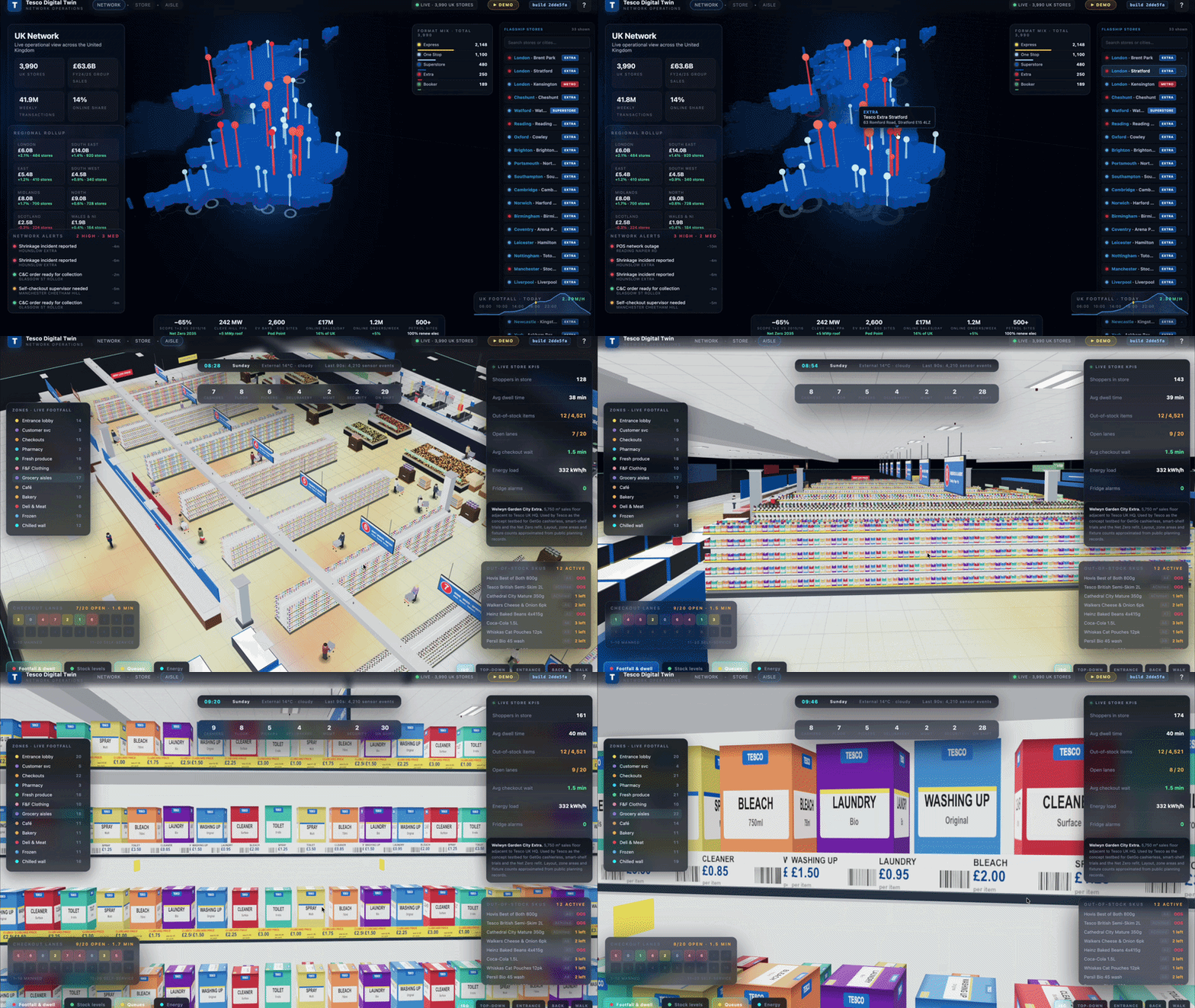
- Connected retail command centre spanning 3,990 stores across the UK
- Real-time visibility of customers, stock, operations and energy
- Site-first 3D twin of stores, car parks and logistics operations
- Live operational view of deliveries, Click & Collect and site activity
- Drill from estate level to individual aisles without changing systems
- Immersive store experience powered by real layouts and live data
- One view of commercial, operational and sustainability performance
A real-data 3D digital twin of operations
A real-time digital twin brings ground operations traffic, scheduling, production, space and delivery into one clear view, helping teams monitor, respond, and make faster, better decisions in the moment.
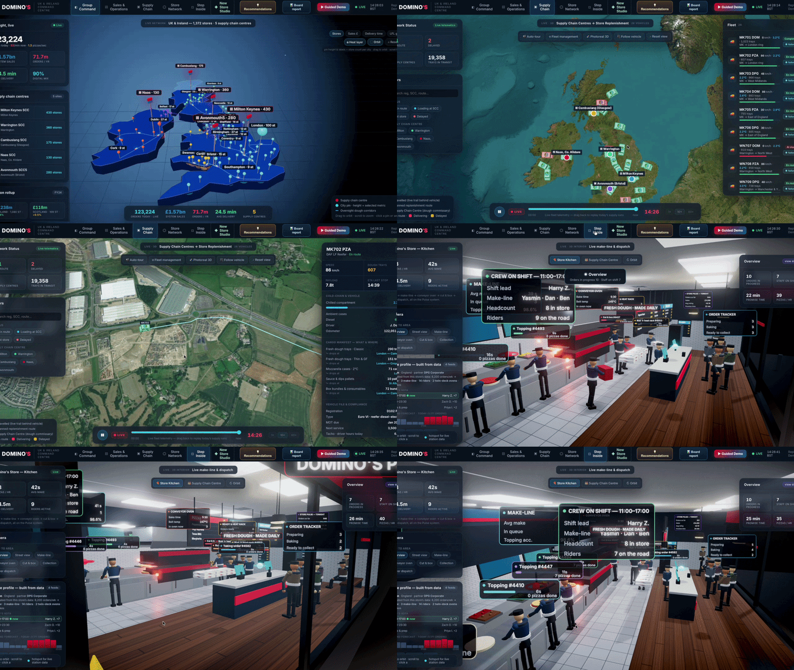
- 3D command centre connecting 1,372 stores and five supply chain centres
- Live view of operations, including sales, orders, deliveries and logistics
- Fleet tracking and replay across the supply chain network
- Interactive store and warehouse exploration with real-time performance data
- Powered by live business data from POS, ordering, workforce and telematics systems
- Decision support tools for planning, recommendations and executive reporting
A xxxxxx 3D digital twin xxxxx
A live, immersive view of the fleet — combining real-time flight data, weather and terrain into a single 3D environment that makes training scenarios real.
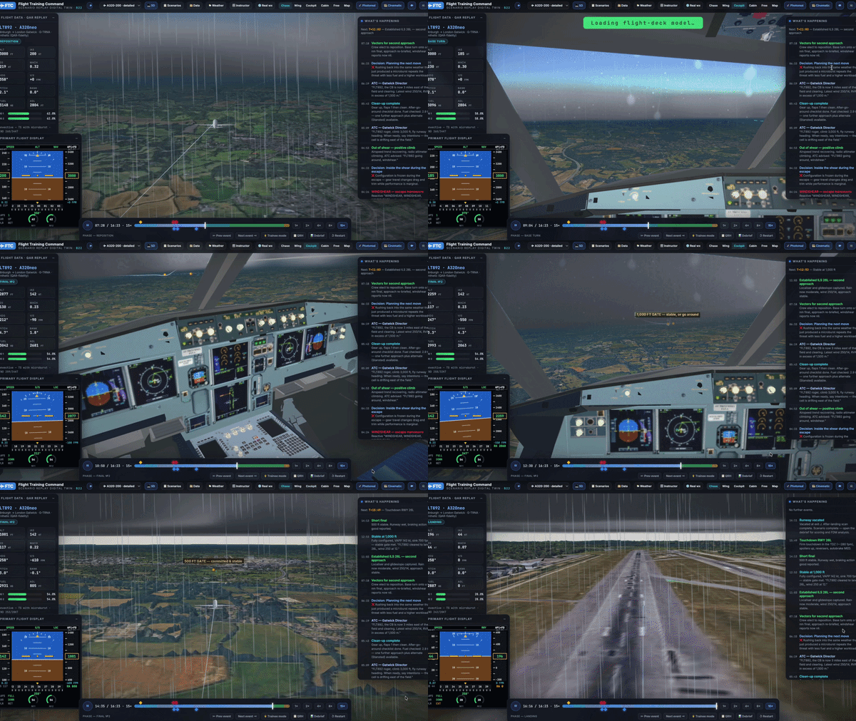
- Turns real flights into immersive training scenarios
- Learn from actual events, not scripted simulations
- Explore real aircraft journeys and live flight activity
- Practice responses to challenging and emergency situations
- Build decision-making skills through realistic scenarios
- Reinforce learning with guided training and debriefs
- Bring flight data together in one simple training platform
Powered by Microsoft Fabric — the unified data platform for AI transformation
At the heart of the experience sits Digital Twin Builder in Real-Time Intelligence — a low-code way to model real-world entities, relationships and behaviours, then enrich them with live operational data flowing through OneLake.
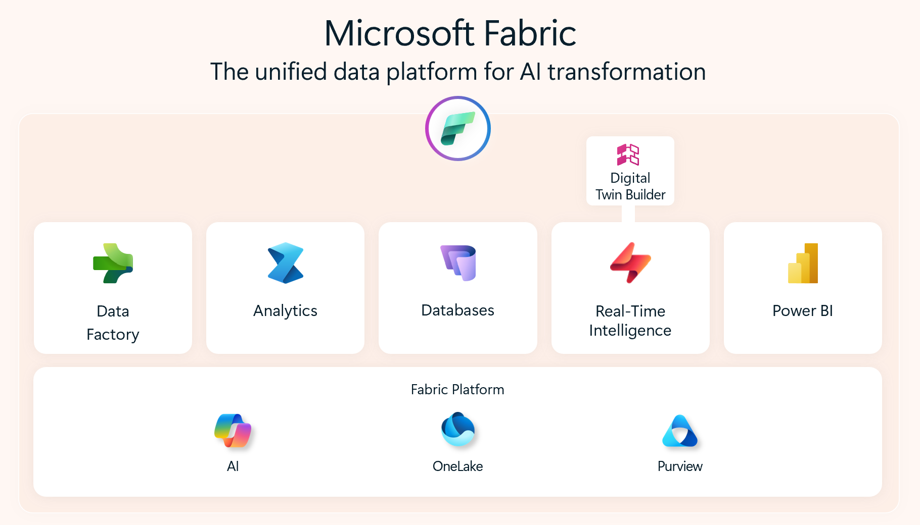
Digital Twin Builder
Turns raw streams into a semantic model of the business — without writing pipelines.
Real-Time Intelligence
Ingests, processes and reacts to live events as they happen.
OneLake
Unifies all data in one open, governed lake — accessible across every Fabric workload.
Power BI, AI & Purview
Close the loop — visualising, reasoning over and governing the twin end-to-end.
Fabric API for GraphQL — the right data, in the right hands, instantly
A simple way to connect apps, dashboards and AI agents to all your Microsoft Fabric data — without waiting on engineering teams to build custom pipelines.
What it means for the business
- Faster decisions — teams get the exact information they need in a single ask, not buried in oversized reports.
- Less waiting on IT — no custom plumbing to build, so new ideas can be tested in days, not months.
- One source of truth — all Fabric data is reachable in one place, so everyone works from the same numbers.
- Lower cost to change — apps and dashboards keep working as the data grows and evolves.
What it unlocks
- AI agents that can answer real questions — securely tapping into live business data, not stale extracts.
- Customer-ready apps and portals — powered directly by trusted Fabric data.
- Self-serve insight — product, ops and commercial teams can explore data without raising tickets.
- Trust and governance built in — the right people see the right data, with full visibility of who accessed what.
From data you can't trust to decisions you can defend.
The problem
Decisions are faster, but trust in the data is falling.
£244B
Cost to the UK economy each year: Quaylogic, 2025
The solution
A visual layer that lets leaders navigate through their data.
The outcome
Faster, defensible decisions — proven in weeks, scaled with confidence.
AI is accelerating decision-making, but 66% of leaders don’t trust the data informing those decisions.
Three layers of capability
Initial Proof of Concept
Understanding the data, the audience, and where insight is being lost.
Initial Proof of Concept
- Use case discovery & workshops
- Data audit and readiness assessment
- Visualisation strategy and roadmap
- Audience and user research
- Data storytelling frameworks
Visualisation & Storytelling
Translating complex information into clear, intuitive visual experiences.
Visualisation & Storytelling
- 3D and spatial data design
- Interactive dashboards and reports
- Algorithm and model visualisation
- Short-form, intuitive formats
- Narrative compression and summarisation
- Accessible and inclusive design
Immersive & Interactive
Moving from dashboards to environments people can navigate and explore.
Immersive & Interactive
- Simulation and scenario modelling
- Digital twins and live environments
- Spatial interfaces and environments
- AI-powered narration and guidance
- Game-engine powered visuals
- Embedding visuals into enterprise tools
Initial Proof of Concept
Building on the first layer of capability — understanding the data, the audience, and where insight is being lost.
Digital Twin Discovery & PoC
£15,000A low-risk engagement designed to identify and validate the commercial value of Digital Twin technology.
- Stakeholder interviews to understand key challenges and opportunities
- Creation of proto-personas and a research-backed problem statement
- Development of a working proof of concept using available data
- Clear storytelling narrative linking the problem, solution and business value
- Recommendations and roadmap for future phases
Investment protection
The £15,000 is fully credited against the next phase if the client chooses to continue. This creates a funded discovery, avoids speculative work, and provides a tangible outcome to support further investment decisions.